body { background:#fff url("http://www.blogblog.com/dots/bg_dots.gif") 50% 0; margin:0; padding:0 10px; text-align:center; font:x-small Verdana,Arial,Sans-serif; color:#333; font-size/* */:/**/small; font-size: /**/small; } /* Page Structure ----------------------------------------------- */ @media all { #content { background:url("http://www.blogblog.com/dots/bg_3dots.gif") no-repeat 250px 50px; width:700px; margin:0 auto; padding:50px 0; text-align:left; } #main { width:450px; float:right; padding:50px 0 20px; font-size:85%; } #main2 { background:url("http://www.blogblog.com/dots/bg_dots2.gif") -100px -100px; padding:20px 10px 15px; } #sidebar { width:200px; float:left; font-size:85%; padding-bottom:20px; } #sidebar2 { background:url("http://www.blogblog.com/dots/bg_dots2.gif") 150px -50px; padding:5px 10px 15px; width:200px; width/* */:/**/180px; width: /**/180px; } } @media handheld { #content { width:90%; } #main { width:100%; float:none; } #sidebar { width:100%; float:none; } #sidebar2 { width:100%; } } html>body #main, html>body #sidebar { /* We only give this fade from white to nothing to browsers that can handle 24-bit transparent PNGs */ background/* */:/**/url("http://www.blogblog.com/dots/bg_white_fade.png") repeat-x left bottom; } /* Title & Description ----------------------------------------------- */ @media all { #blog-title { margin:0 0 .5em; font:250%/1.4em Georgia,Serif; color:#353; } #blog-title a { color:#353; text-decoration:none; } #description { margin:0 0 1.75em; color:#996; } #blog-mobile-title { display:none; } #description-mobile { display:none; } } @media handheld { #blog-title { display:none; } #description { display:none; } #blog-mobile-title { display:block; margin:0 0 .5em; font:250%/1.4em Georgia,Serif; color:#353; } #blog-mobile-title a { color:#353; text-decoration:none; } #description-mobile { display:block; margin:0 0 1.75em; color:#996; } } /* Links ----------------------------------------------- */ a:link { color:#488; } a:visited { color:#885; } a:hover { color:#000; } a img { border-width:0; } /* Posts ----------------------------------------------- */ .date-header { margin:0 0 .75em; padding-bottom:.35em; border-bottom:1px dotted #9b9; font:95%/1.4em Georgia,Serif; text-transform:uppercase; letter-spacing:.3em; color:#663; } .post { margin:0 0 2.5em; line-height:1.6em; } .post-title { margin:.25em 0; font:bold 130%/1.4em Georgia,Serif; color:#333; } .post-title a, .post-title strong { background:url("http://www.blogblog.com/dots/bg_post_title.gif") no-repeat 0 .25em; display:block; color:#333; text-decoration:none; padding:0 0 1px 45px; } .post-title a:hover { color:#000; } .post p { margin:0 0 .75em; } p.post-footer { margin:0; text-align:right; } p.post-footer em { display:block; float:left; text-align:left; font-style:normal; color:#996; } a.comment-link { /* IE5.0/Win doesn't apply padding to inline elements, so we hide these two declarations from it */ background/* */:/**/url("http://www.blogblog.com/dots/icon_comment.gif") no-repeat 0 .25em; padding-left:15px; } html>body a.comment-link { /* Respecified, for IE5/Mac's benefit */ background:url("http://www.blogblog.com/dots/icon_comment.gif") no-repeat 0 .25em; padding-left:15px; } .post img { margin:0 0 5px 0; padding:4px; border:1px solid #cca; } /* Comments ----------------------------------------------- */ #comments { margin:0; } #comments h4 { margin:0 0 10px; border-top:1px dotted #9b9; padding-top:.5em; font:bold 110%/1.4em Georgia,Serif; color:#333; } #comments-block { line-height:1.6em; } .comment-poster { background:url("http://www.blogblog.com/dots/icon_comment.gif") no-repeat 2px .35em; margin:.5em 0 0; padding:0 0 0 20px; font-weight:bold; } .comment-body { margin:0; padding:0 0 0 20px; } .comment-body p { margin:0 0 .5em; } .comment-timestamp { margin:0 0 .5em; padding:0 0 .75em 20px; color:#996; } .comment-timestamp a:link { color:#996; } .deleted-comment { font-style:italic; color:gray; } .paging-control-container { float: right; margin: 0px 6px 0px 0px; font-size: 80%; } .unneeded-paging-control { visibility: hidden; } /* More Sidebar Content ----------------------------------------------- */ .sidebar-title { margin:2em 0 .75em; padding-bottom:.35em; border-bottom:1px dotted #9b9; font:95%/1.4em Georgia,Serif; text-transform:uppercase; letter-spacing:.3em; color:#663; } #sidebar p { margin:0 0 .75em; line-height:1.6em; } #sidebar ul { margin:.5em 0 1em; padding:0 0px; list-style:none; line-height:1.5em; } #sidebar ul li { background:url("http://www.blogblog.com/dots/bullet.gif") no-repeat 3px .45em; margin:0; padding:0 0 5px 15px; } #sidebar p { margin:0 0 .6em; } /* Profile ----------------------------------------------- */ .profile-datablock { margin:0 0 1em; } .profile-img { display:inline; } .profile-img img { float:left; margin:0 8px 5px 0; border:4px solid #cc9; } .profile-data { margin:0; line-height:1.5em; } .profile-data strong { display:block; } .profile-textblock { clear:left; } /* Footer ----------------------------------------------- */ #footer { clear:both; padding:15px 0 0; } #footer hr { display:none; } #footer p { margin:0; } /* Feeds ----------------------------------------------- */ #blogfeeds { } #postfeeds { padding-left: 20px }

Prudent Baby

Get sewing how to, sewing tutorials, and sewing help to learn sewing. We offer sewing tutorial for sewing moms.

Wednesday, September 22, 2010

What Color Should I Paint This Mirror?


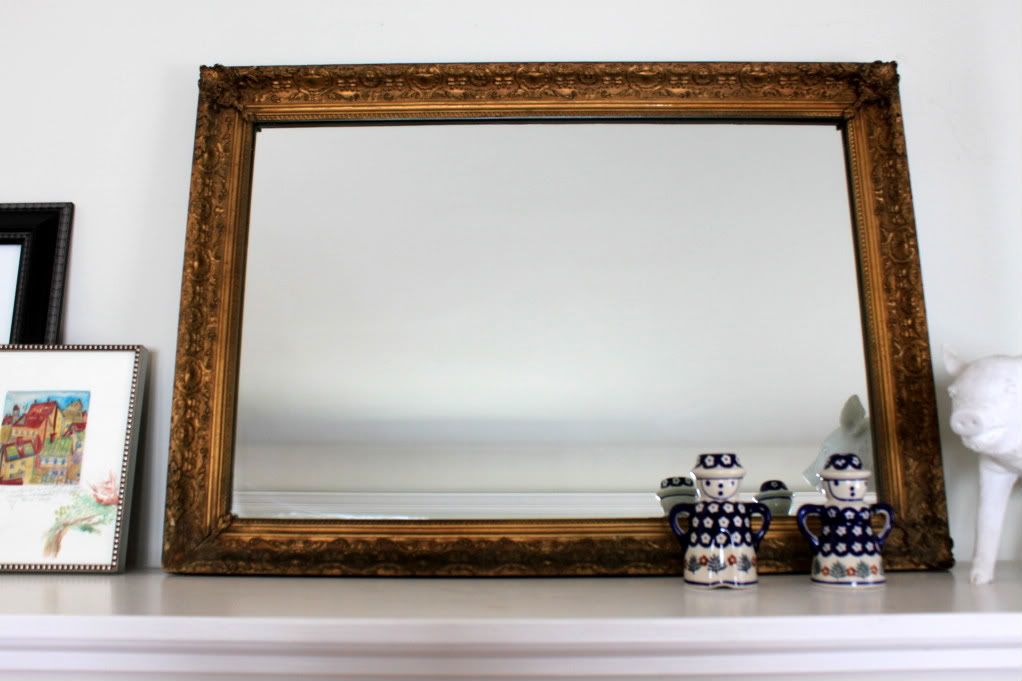
Ladies!  I picked up this awesome mirror at Goodwill for $19.99.  I've been looking for the perfect mirror for above the fireplace, Score!  But I can't decide what color to paint it, or if I should paint it at all.

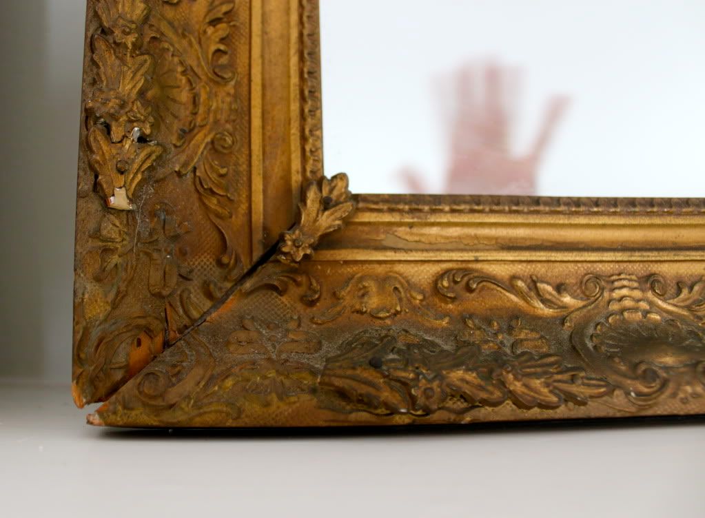
It's hardwood and I kind of like the dirty bronze sheen, but up close, it's a little grungy as you can see:


Our living room has a distinctive turquoise couch, so I'm not sure which way to go. White? Silver? Gold? Bright red? Mustard yellow?

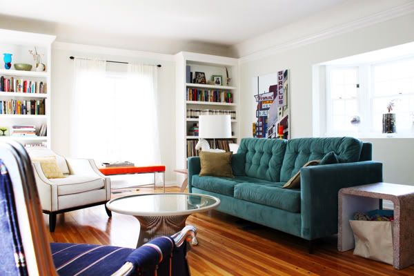
If you really want to take this assignment seriously, there are a ton more photos of the living room in question on my Apartment Therapy Home Tour.

Please weigh in down in the comments. Your feedback could even win you this week's best-comment prize, that Aleene's Tacky Pack! XOXO

Labels: , , , ,

72 Comments:

Blogger Jessica said...

I definitely vote mustard yellow.

September 22, 2010 at 2:13 PM  
Blogger Sandy a la Mode said...

definitely a bright fun color or white! i like jessica's idea of mustard yellow!

September 22, 2010 at 2:16 PM  
Blogger Ashley said...

I vote mustard... it's my new fave. You could distress the finish a little and let some gold show through too.

September 22, 2010 at 2:16 PM  
Anonymous Anonymous said...

i vote for a bold red!

September 22, 2010 at 2:17 PM  
Blogger Valerie said...

RED. (note: not just red... but RED.)

September 22, 2010 at 2:23 PM  
Blogger SandyQuilts said...

black

September 22, 2010 at 2:28 PM  
Blogger Jade said...

I vote orange. Tangerine. Looks like maybe that's what a window bench is also? Orange + Turquoise = Extra super fantastic.

September 22, 2010 at 2:31 PM  
Blogger April said...

i vote mustard yellow! hello!

September 22, 2010 at 2:33 PM  
Blogger Carly said...

First up: I love the freshness of your white walled living room! So refreshing.

Second up: Is there any real question? Red of course. It is (always) the perfect accent color particularly when it comes to a mirror. It breathes confidence, calm, and has an air of being carefree. Just the thing you need when you take that last glance at yourself as you dash out the door. Or just before you cozy up on the couch with your needlepoint or a good book.

Red. By all means, red.

September 22, 2010 at 2:37 PM  
Blogger Deanna said...

All I saw was the title of the post and the mirror and I thought "It has to be red!" Maybe distress the red and have a white paint behind... But definitely go for red. White walls need bright colours.

September 22, 2010 at 2:42 PM  
Blogger Marion Acres said...

If we are choosing from your list of colors, then mustard yellow would add just the right touch, but if I may add a unique opinion, I'd have to say that olive green, like the bowl on the top shelf of your left display, would be a perfect accent to the room. Red would be too bold, although that was my first instinct with the ABC book on your end table and the red pillow in your side chair. I think the olive green would perfectly compliment your style while also not drawing too much attention and leaving room for the eye to wander to the other unique features in your area. :)

September 22, 2010 at 2:54 PM  
Blogger Unknown said...

BRIGHT YELLOW!!

September 22, 2010 at 2:55 PM  
Blogger lemondropdreams said...

Raspberry pink!

September 22, 2010 at 2:58 PM  
Blogger Amy @ Increasingly Domestic said...

I vote for mustard yellow!!!!

September 22, 2010 at 3:09 PM  
Blogger .micki. said...

Do I see an orange bench there in the background? I think you should go with that color of orange.

September 22, 2010 at 3:11 PM  
Blogger Caroline @ The Feminist Housewife said...

Mustard yellow! Or any warm color...a burnt orange or deep red would be nice too!

September 22, 2010 at 3:34 PM  
Blogger carrie said...

What about a plum color?

September 22, 2010 at 3:34 PM  
Blogger Itty Bitty Beasties said...

I'm definitely torn between the orange or mustard choice. But I want your couch. I'll email you my address. :o)

September 22, 2010 at 3:35 PM  
Blogger Lena K. said...

white!

September 22, 2010 at 3:43 PM  
Blogger Emily said...

Yellow or turquoise. Great find. :)

September 22, 2010 at 3:59 PM  
Blogger Tanya said...

I vote a goldish yellow -- not a BRIGHT yellow (like your lamp), but a nice muted goldish yellow. :)

September 22, 2010 at 4:09 PM  
Blogger Rachel said...

why mustard yellow of course!

September 22, 2010 at 4:25 PM  
Blogger Unknown said...

I think silver would be fab!

September 22, 2010 at 4:29 PM  
Blogger Miss Jillian said...

I was thinking mustard yellow ever before I scrolled all the way down and saw the photo of the actual room. I think bold mustard yellow would look great with that teal couch.

September 22, 2010 at 4:31 PM  
Blogger Starr said...

Copper!

September 22, 2010 at 4:32 PM  
Blogger Ashley said...

The very first thought that came to my head was "Yellow!" I think it would be a beautiful contrast against the white and teal in the room :)

September 22, 2010 at 4:50 PM  
Blogger The Andelins said...

I vote for mustard yellow!! The walls are already light, so painting it white would make it disappear into the walls. You've already got a reddish/orangeish thing going on by the window... Plus, I am a big fan of mustard yellow right now. Good luck!!

September 22, 2010 at 4:53 PM  
Blogger Kristin said...

I vote for mustard yellow too! I think it would look great with the couch!

September 22, 2010 at 4:59 PM  
Blogger Jamie said...

Are the figurines in front of it dark blue? If so paint it to match. I love those pieces and painting the mirror to match would help them stand out more. It also looks like you have a chair that is about the same color. That would tie it in with the room.

September 22, 2010 at 5:07 PM  
Blogger Unknown said...

Mustard yellow 100%!

September 22, 2010 at 5:27 PM  
Blogger Jennifer Mulvihill said...

I think you should paint it a color that compliments your upholstered bench. My vote would be a rich orange color--it would play off of some of your books on the bookshelves as well. AND if you don't love it, you can always add another coat of paint! :)

September 22, 2010 at 5:36 PM  
Blogger Unknown said...

I think you should paint it orange, to match that bench under the window. I think its orange! Whatever color it is, i love it!

September 22, 2010 at 5:41 PM  
Blogger Liz said...

Definately yellow!

September 22, 2010 at 6:07 PM  
Blogger Sam said...

Mustard yellow FOR SHO'. It would look great with the couch and with that little picture already on the mantel.

September 22, 2010 at 6:19 PM  
Blogger Marianne & Clayton said...

A shiny marine navy blue. I can't believe I am the first one to suggest it. The aqua and peacock trend will be heading towards navy in about a year. Beat the trend. And as everyone knows, navy goes with everything.

September 22, 2010 at 6:26 PM  
Blogger young said...

Considering the couch, love the idea of a mustard yellow!

September 22, 2010 at 7:20 PM  
Anonymous Anonymous said...

I vote bright red!!

September 22, 2010 at 7:25 PM  
Anonymous Anonymous said...

How about none of the above. Go turquoise. Whenever I see rooms that look good, one of the things I notice is that there is repetition of color, and never just one thing of a color. That said, you have an awesome couch, but you need to repeat the color to make it looks like it belongs in the room. Just my two cents.

http://aucoeur.wordpress.com

September 22, 2010 at 7:28 PM  
Blogger Erin said...

My vote is for orange. Sand just a little off to distress it and have a little bit of the brassy color come through. I think that would be great. Love your place...I wish my hubby would let me go wild with our house.

September 22, 2010 at 7:31 PM  
Blogger Stephanie said...

Red for sure. That was my first thought upon seeing the room.

September 22, 2010 at 7:40 PM  
Blogger Natalia said...

I would say bright red to pull out some of the hidden reds in the room

September 22, 2010 at 7:58 PM  
Blogger Mallory said...

I think either orange or a lovely vintage turquoise. That couch is awesome and a mirror in the same color would really accentuate it.

September 22, 2010 at 8:01 PM  
Blogger Rylee said...

I say Red or mustard

September 22, 2010 at 8:04 PM  
Blogger Kelsey said...

I would go with either mustard yellow or a deep smokey gray...I LOVE gray in unexpected pieces like that...it'd be a super pretty non-neutral!

September 22, 2010 at 8:13 PM  
Blogger Stacy said...

colonel mustard in the living room with the spray paint...

September 22, 2010 at 8:28 PM  
Blogger Jennifer Marie Land said...

So I'm totally in love with Mustard Yellow these days...its the color of my go too "I'm having a bad hair day" hat. I considered it for your frame but I'm gonna go with a bright cool red instead. You have a lot of mustard in your room right now and I thought the red would blend well but not make it look overdone which the orange could.

PS. I'm in love with the orange velvety pillow on the blue chair. Such fun colors!

September 22, 2010 at 8:52 PM  
Blogger Sara Delia said...

You clearly need to paint the mirror turquoise. It will pull the whole room together and make you smile every time you see it.

September 22, 2010 at 8:54 PM  
Blogger Designs by Jenean said...

I'm gonna go with the Bold Red crowd. Make a statement!

September 22, 2010 at 10:45 PM  
Blogger Danielle said...

Orange! It has been my newest favorite color for the past year-ish. Do another one and send it to me, please!

September 23, 2010 at 5:47 AM  
Blogger Laura said...

RED

September 23, 2010 at 6:07 AM  
Blogger Lisa said...

I love red but I have to go with mustard yellow here - I am obsessed with yellow/gold lately & I think it would look great in this room. Gorgeous room! I love your Polish salt & pepper people too.

September 23, 2010 at 6:34 AM  
Blogger Alex said...

How about the green color of that dish on your book shelf? It's such a pretty green.

September 23, 2010 at 8:05 AM  
Anonymous Anonymous said...

I have an oval mirror sitting around waiting to be painted too. I am planning on doing a bright lacquer red. I think it would go great in your living room.

September 23, 2010 at 8:12 AM  
Blogger Kimberly said...

Oh I love it as is! But if you were to change it, a very dark silvery grey would be cool, or a bright pop of color perhaps bright orange to match the other bright pops.

September 23, 2010 at 8:21 AM  
Blogger Susan said...

I'd go with bright red!

September 23, 2010 at 8:58 AM  
Blogger Angela said...

I don't really think you can go wrong. But my vote is for lime green.

September 23, 2010 at 9:12 AM  
Blogger Charlene said...

I say some shade of orange! That would really pop with your chesterfield.

September 23, 2010 at 9:36 AM  
Blogger Jenny said...

I say go for a matte turquoise to match your (incredible and I am so envious of)couch!

September 23, 2010 at 9:37 AM  
Blogger Ali Smith and Noah Thomas said...

Yes, red, but maybe persimmon red! You definitely don't want something too matchy-matchy!

September 23, 2010 at 10:02 AM  
Blogger Aja said...

Stay with the gold. It might take away from the beauty of the frame if you paint it another color. A fresh coat would surely liven it up!

September 23, 2010 at 10:32 AM  
Blogger Krystle... said...

Mustard or Bright Orange

September 23, 2010 at 11:00 AM  
Anonymous Anonymous said...

I vote for dark turquoise with a dusting of silver on the ornate parts.

September 23, 2010 at 11:40 AM  
Blogger Meghan Rickard said...

Definitely something bright, and a matching color accent of something else in your living room.

September 23, 2010 at 2:01 PM  
Anonymous Anonymous said...

Mustard yellow! Everybody loves condiment-colored decor!

September 23, 2010 at 2:20 PM  
Blogger Unknown said...

glossy orange to match the bench under the window!

September 23, 2010 at 7:15 PM  
Blogger Adventure of the Hoffman family said...

When you take into consideration the rest of the room the mustard color is the obvious choice. Personally I would do a copper color. It needs to stand out, be eye-catching, and radiate light.

September 23, 2010 at 8:23 PM  
Blogger Unknown said...

How about eggplant? I really like that with the couch color, it would be neutral but funky.

Can't wait to see:)

September 23, 2010 at 8:45 PM  
Blogger sex, laura, rock & roll said...

i just did one very similar to this in purple lacquer and it turned out AMAZING.

(when i say purple lacquer i really mean purple krylon spray paint)

my vote is purple :)

September 24, 2010 at 6:43 AM  
Blogger { to be charmed } said...

Oh my gosh that couch is amazing! I'd have to go with Turquoise topped with a light coating of walnut stain to give it a slight distressed look. On a completely separate topic, where are the decorative pillows?! Hmmm, perhaps there will be a tutorial on decorative pillow around the corner?! ;)

September 24, 2010 at 7:38 AM  
Anonymous Anonymous said...

I sometimes go into paralysis when it comes to picking colors. I don't want to mess up and choose the "wrong" one (forgetting that I can always change it). So, this situation is no different (except it's not MINE). I'm feeling a little orange-y on this one.

September 24, 2010 at 11:06 AM  
Blogger Alexandra Auld said...

Navy/Cobalt blue! There's nothing better then stark white and cobalt blue!

September 25, 2010 at 12:09 AM  
Blogger Modern Survivor said...

I had a gold 1970's mirror that I have been thinking the same things about. I have mentally decided to try using black crackle paint over the gold so that the gold will peak through and I won't lose the character. Is crackle painting out? I think it would be spectacular!

September 25, 2010 at 11:25 PM  

Post a Comment

Subscribe to Post Comments [Atom]

<< Home