body { background:#fff url("http://www.blogblog.com/dots/bg_dots.gif") 50% 0; margin:0; padding:0 10px; text-align:center; font:x-small Verdana,Arial,Sans-serif; color:#333; font-size/* */:/**/small; font-size: /**/small; } /* Page Structure ----------------------------------------------- */ @media all { #content { background:url("http://www.blogblog.com/dots/bg_3dots.gif") no-repeat 250px 50px; width:700px; margin:0 auto; padding:50px 0; text-align:left; } #main { width:450px; float:right; padding:50px 0 20px; font-size:85%; } #main2 { background:url("http://www.blogblog.com/dots/bg_dots2.gif") -100px -100px; padding:20px 10px 15px; } #sidebar { width:200px; float:left; font-size:85%; padding-bottom:20px; } #sidebar2 { background:url("http://www.blogblog.com/dots/bg_dots2.gif") 150px -50px; padding:5px 10px 15px; width:200px; width/* */:/**/180px; width: /**/180px; } } @media handheld { #content { width:90%; } #main { width:100%; float:none; } #sidebar { width:100%; float:none; } #sidebar2 { width:100%; } } html>body #main, html>body #sidebar { /* We only give this fade from white to nothing to browsers that can handle 24-bit transparent PNGs */ background/* */:/**/url("http://www.blogblog.com/dots/bg_white_fade.png") repeat-x left bottom; } /* Title & Description ----------------------------------------------- */ @media all { #blog-title { margin:0 0 .5em; font:250%/1.4em Georgia,Serif; color:#353; } #blog-title a { color:#353; text-decoration:none; } #description { margin:0 0 1.75em; color:#996; } #blog-mobile-title { display:none; } #description-mobile { display:none; } } @media handheld { #blog-title { display:none; } #description { display:none; } #blog-mobile-title { display:block; margin:0 0 .5em; font:250%/1.4em Georgia,Serif; color:#353; } #blog-mobile-title a { color:#353; text-decoration:none; } #description-mobile { display:block; margin:0 0 1.75em; color:#996; } } /* Links ----------------------------------------------- */ a:link { color:#488; } a:visited { color:#885; } a:hover { color:#000; } a img { border-width:0; } /* Posts ----------------------------------------------- */ .date-header { margin:0 0 .75em; padding-bottom:.35em; border-bottom:1px dotted #9b9; font:95%/1.4em Georgia,Serif; text-transform:uppercase; letter-spacing:.3em; color:#663; } .post { margin:0 0 2.5em; line-height:1.6em; } .post-title { margin:.25em 0; font:bold 130%/1.4em Georgia,Serif; color:#333; } .post-title a, .post-title strong { background:url("http://www.blogblog.com/dots/bg_post_title.gif") no-repeat 0 .25em; display:block; color:#333; text-decoration:none; padding:0 0 1px 45px; } .post-title a:hover { color:#000; } .post p { margin:0 0 .75em; } p.post-footer { margin:0; text-align:right; } p.post-footer em { display:block; float:left; text-align:left; font-style:normal; color:#996; } a.comment-link { /* IE5.0/Win doesn't apply padding to inline elements, so we hide these two declarations from it */ background/* */:/**/url("http://www.blogblog.com/dots/icon_comment.gif") no-repeat 0 .25em; padding-left:15px; } html>body a.comment-link { /* Respecified, for IE5/Mac's benefit */ background:url("http://www.blogblog.com/dots/icon_comment.gif") no-repeat 0 .25em; padding-left:15px; } .post img { margin:0 0 5px 0; padding:4px; border:1px solid #cca; } /* Comments ----------------------------------------------- */ #comments { margin:0; } #comments h4 { margin:0 0 10px; border-top:1px dotted #9b9; padding-top:.5em; font:bold 110%/1.4em Georgia,Serif; color:#333; } #comments-block { line-height:1.6em; } .comment-poster { background:url("http://www.blogblog.com/dots/icon_comment.gif") no-repeat 2px .35em; margin:.5em 0 0; padding:0 0 0 20px; font-weight:bold; } .comment-body { margin:0; padding:0 0 0 20px; } .comment-body p { margin:0 0 .5em; } .comment-timestamp { margin:0 0 .5em; padding:0 0 .75em 20px; color:#996; } .comment-timestamp a:link { color:#996; } .deleted-comment { font-style:italic; color:gray; } .paging-control-container { float: right; margin: 0px 6px 0px 0px; font-size: 80%; } .unneeded-paging-control { visibility: hidden; } /* More Sidebar Content ----------------------------------------------- */ .sidebar-title { margin:2em 0 .75em; padding-bottom:.35em; border-bottom:1px dotted #9b9; font:95%/1.4em Georgia,Serif; text-transform:uppercase; letter-spacing:.3em; color:#663; } #sidebar p { margin:0 0 .75em; line-height:1.6em; } #sidebar ul { margin:.5em 0 1em; padding:0 0px; list-style:none; line-height:1.5em; } #sidebar ul li { background:url("http://www.blogblog.com/dots/bullet.gif") no-repeat 3px .45em; margin:0; padding:0 0 5px 15px; } #sidebar p { margin:0 0 .6em; } /* Profile ----------------------------------------------- */ .profile-datablock { margin:0 0 1em; } .profile-img { display:inline; } .profile-img img { float:left; margin:0 8px 5px 0; border:4px solid #cc9; } .profile-data { margin:0; line-height:1.5em; } .profile-data strong { display:block; } .profile-textblock { clear:left; } /* Footer ----------------------------------------------- */ #footer { clear:both; padding:15px 0 0; } #footer hr { display:none; } #footer p { margin:0; } /* Feeds ----------------------------------------------- */ #blogfeeds { } #postfeeds { padding-left: 20px }

Prudent Baby

Get sewing how to, sewing tutorials, and sewing help to learn sewing. We offer sewing tutorial for sewing moms.

Thursday, September 30, 2010

"Curtains"... Kinda


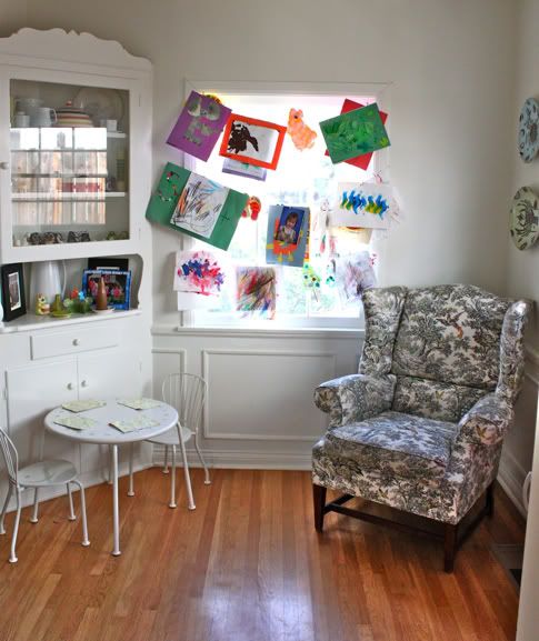
I have this window in my house that has been sitting naked for over a year, as I refuse to accept that I am never going to sew a curtain for it. I've been planning and planning to create a DIY Roman Shade tutorial for you, but there really isn't a super simple way to do it. So the window has sat bare. I even have the fabric! Anyway. Scarlet just started pre-school and every day she comes home with another awesome new piece of artwork. I needed a place to display them all, so this is what I came up with! It's just nails, string, and tiny wooden clothespins. After school everyday she picks a spot and we pile the artwork on. It's working pretty well at hiding my disgusting robe-clad self from the poor unsuspecting neighbors while I'm making coffee in the morning, too.
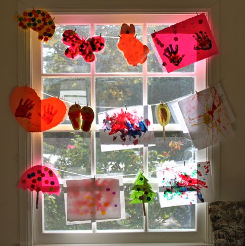
What do you think? Ghetto? Or cute?

And remember leave a comment and you might win that purty Sandi Henderson fat quarter pictured over on the top left!

Labels: , , , , , ,

44 Comments:

Blogger jillian sara said...

This was such a cool idea! Looks better than on the fridge and definitely more creative. Would love to win that fat quarter! :)

September 30, 2010 at 10:00 AM  
Blogger Mallory said...

What a perfect idea of displaying your kids artwork. I can't throw anything away that my daughter makes....this may come in handy! :)

September 30, 2010 at 10:06 AM  
Blogger Sara said...

Cute! Definitely not ghetto. I like the idea of it constantly changing with each new project that comes home.

Hope it's ok that I signed up for the Prudent MAMA news letter, even though I'm not a mama!

September 30, 2010 at 10:10 AM  
Blogger Unknown said...

This is too too cute!

September 30, 2010 at 10:11 AM  
Blogger Cath said...

Perfect!

Lovely when a solution to a dilemma also warms some hearts.

September 30, 2010 at 10:16 AM  
Anonymous Anonymous said...

cute, time for art fun, thanks for the inspiration

September 30, 2010 at 10:23 AM  
Blogger Anu said...

super cute! sorry if you've already said, but where is the adorable table set from?

September 30, 2010 at 10:26 AM  
Blogger Jaime said...

thanks ladies! anu - it's from IKEA. gotta love ikea.

September 30, 2010 at 10:27 AM  
Blogger miss olivia. said...

love it! can't wait til my little one can paint, white paper, black fingerpaint, artwork will be everywhere:)

September 30, 2010 at 10:28 AM  
Blogger Sarah said...

This comment has been removed by the author.

September 30, 2010 at 10:33 AM  
Blogger Sarah said...

It may be "ghetto" but that doesn't mean it's not cute! Love it!

September 30, 2010 at 10:34 AM  
Blogger miranda said...

Love it for sure! If I thought it was ghetto, my own house would be looking pretty ghetto too! I've shelved my son's room need for curtains in a similar way. You can check it out here: http://sippycupsandfingerprints.blogspot.com/2010/07/summer-house-projects.html
And my girls room has some great curtains too! :) http://sippycupsandfingerprints.blogspot.com/2010/07/peek-in-girls-room-while-its-clean.html

September 30, 2010 at 10:47 AM  
Blogger Jacinda said...

I totally need this. Clare caught me tossing some drawings the other day. She was heartbroken! I have some making up to do!

September 30, 2010 at 10:49 AM  
Blogger Team Botanical said...

Definitely cute, and definitely not ghetto. There is a toile arm chair flanking the display, after all.

Oh, and as far as the artwork management goes, I take a picture of everything that comes through the door, keep the special ones and trash the rest. I hope that this practice still works once she knows where her precious art is going.

September 30, 2010 at 11:03 AM  
Blogger Melissa at Perry Jayne said...

If necessity is the mother of invention ... then massive amounts of cute artwork is apparently also the mother of invention. Great idea!

September 30, 2010 at 11:37 AM  
Blogger Sugar Bear said...

Love it! Not ghetto at all. Can I ask where you got the table and chairs? I just started looking for a set for my 18 month old and yours look great and look like they fit into smaller areas which is our challenge!
Karla

September 30, 2010 at 11:46 AM  
Blogger Kathryn said...

Any mommy would love this! I might transform my dining room window! I love kid artwork - always makes me smile. :)

September 30, 2010 at 12:15 PM  
Blogger Jess said...

i love it... and the best part is that preschool artwork is usually very holiday oriented, so youre set for decorating this year! (that one window, anyways) looks like your little one has made herself useful, time to put her to use for the other windows! haha

September 30, 2010 at 12:54 PM  
Blogger Julie said...

I do a similar thing on the kitchen wall- but I really like how the light shines through the art.

September 30, 2010 at 12:54 PM  
Blogger Unknown said...

cute! I've been looking for something to do with my daughters preschool artwork.

September 30, 2010 at 1:08 PM  
Blogger Amy L said...

Definitely cute - great idea! I should do something similar in the playroom window. We have piles of artwork that I've been wanting to display.

September 30, 2010 at 1:08 PM  
Blogger Kelli said...

I love it...but of course I am biased because I have done the same thing in our kids playroom. Though I'm not hardcore enough to use nails...I used yarn and push pins. But I love it...I think those kind of curtains bring you more happiness then any other kind would.

September 30, 2010 at 1:15 PM  
Blogger Courtney said...

cute, but here's a good tute if you change your mind
http://jenduncan.typepad.com/whats_new/2008/11/roman-blind-tutorial-in-20-pictures-or-less.html

courtlyons@yahoo.com

September 30, 2010 at 1:36 PM  
Blogger beth said...

oh, please do the tute - although your window is pretty with artwork... it's just that I need to do some roman shades and I have been looking ALL over for help!

September 30, 2010 at 1:38 PM  
Blogger Vic said...

Lol @ "...ghettto or cute?" - I definately think cute from the inside, and from the outside, well, who cares, really?! Mostly I am writing to say that I have a Scarlett too!

September 30, 2010 at 1:45 PM  
Blogger Tara @ Feels Like Home said...

I love it! I'd sooner decorate with my daughter's artwork than anything else there is.

September 30, 2010 at 1:57 PM  
Blogger melifaif said...

I think it is SUPER cute. And besides...you are making your lil one feel like a STAR! What more could you ask for??? SO SWEET, I love it...

September 30, 2010 at 2:29 PM  
Blogger Tong said...

ghetto? yes. cute, most definitely!!! i'm totally going to do something like this with my kids' art work, when i have some... lol.

September 30, 2010 at 4:28 PM  
Blogger aubiebobie said...

Adorable.

September 30, 2010 at 6:02 PM  
Blogger courtney said...

i love it! better than putting it on the back of the pantry door!

September 30, 2010 at 6:30 PM  
Blogger Jennie said...

I think it's totally cute!

Everything in my house ends up on the refrigerator, and must be within the kids line of vision(which really isn't too big). Then when I take it down to make room for more, it's drama and they're wondering where the other stuff went.

September 30, 2010 at 8:25 PM  
Blogger mamma of 2 said...

My friend is going to do this at her house!! I like it!

September 30, 2010 at 9:31 PM  
Blogger Little Monkey Tutu said...

I think it's better than any curtain could ever be!!! Yay art!!! :)

October 1, 2010 at 7:33 AM  
Blogger Heather said...

The 2nd pic, with the smaller, shapelier artwork is cuter, I think.
Not that the 1st is ghetto...you guys are so not ghetto...even when you're dresses in WT or rollerskating gear...

October 1, 2010 at 8:31 AM  
Anonymous Anonymous said...

i saw this with my own 2 eyes and loved it. forgot to tell you.
xx

October 1, 2010 at 12:19 PM  
Anonymous Anonymous said...

I am so stealing this idea! We used to have a "gallery space" in our dining room, but we are re-doing the room, so the gallery is gone for now.

I love how displaying their art makes them make more. And encourages them to think about what they are making. LOVE kid art!

October 1, 2010 at 2:47 PM  
Blogger Nikki said...

Charming and clever solution for you and your growing artwork collection. What child wouldn't appreciate having a display like this of their artwork shared at home. Very Cool, even those of us who are grandmothers could use this idea to cheer up a window with favorite art pieces from our beloved grandchildren. Thanks for sharing this display tip.

October 1, 2010 at 4:39 PM  
Blogger Alice said...

This is a cool idea!! And the theme can change every week. I bet your daughter is proud to display her art work.

October 2, 2010 at 1:03 PM  
Blogger Marcy said...

My daughter and I were just having this conversation at lunch today -- since GrandDolly #1 has started preschool, she is bringing artwork home nearly every day. Darling Daughtenow working the cupboards -- I'm going to tell her about this idea so that she can spread the wealth into her living room!!

October 2, 2010 at 1:51 PM  
Blogger Tiffany from HOLIDAY said...

I think it's cute & just did something similar since I haven't purchased the Ballard giant gold framed bulletin board yet. I also have some bare windows and am about to break down and just buy plain white romans at Lowes and trim them out w/ simple ribbon. I'll be anxiously awaiting a tutorial on romans! xo

October 2, 2010 at 2:32 PM  
Blogger Aja Reeser said...

i love it! i've done something similar on a big wall in my daughter's room but it never occurred to me to hang her art over the window. the light through the papers adds such a fun dimension!

October 2, 2010 at 6:41 PM  
Blogger Wendy said...

totally cute! I'm saving this idea for the time when Jack starts coloring on the page instead of the table!

October 4, 2010 at 7:14 PM  
Blogger Paulena B. said...

I think it's a wonderful idea.

October 6, 2010 at 8:25 AM  
Blogger Rising Designs said...

Send Clare's artwork to Grammie, please!

October 16, 2010 at 10:29 AM  

Post a Comment

Subscribe to Post Comments [Atom]

<< Home