body { background:#fff url("http://www.blogblog.com/dots/bg_dots.gif") 50% 0; margin:0; padding:0 10px; text-align:center; font:x-small Verdana,Arial,Sans-serif; color:#333; font-size/* */:/**/small; font-size: /**/small; } /* Page Structure ----------------------------------------------- */ @media all { #content { background:url("http://www.blogblog.com/dots/bg_3dots.gif") no-repeat 250px 50px; width:700px; margin:0 auto; padding:50px 0; text-align:left; } #main { width:450px; float:right; padding:50px 0 20px; font-size:85%; } #main2 { background:url("http://www.blogblog.com/dots/bg_dots2.gif") -100px -100px; padding:20px 10px 15px; } #sidebar { width:200px; float:left; font-size:85%; padding-bottom:20px; } #sidebar2 { background:url("http://www.blogblog.com/dots/bg_dots2.gif") 150px -50px; padding:5px 10px 15px; width:200px; width/* */:/**/180px; width: /**/180px; } } @media handheld { #content { width:90%; } #main { width:100%; float:none; } #sidebar { width:100%; float:none; } #sidebar2 { width:100%; } } html>body #main, html>body #sidebar { /* We only give this fade from white to nothing to browsers that can handle 24-bit transparent PNGs */ background/* */:/**/url("http://www.blogblog.com/dots/bg_white_fade.png") repeat-x left bottom; } /* Title & Description ----------------------------------------------- */ @media all { #blog-title { margin:0 0 .5em; font:250%/1.4em Georgia,Serif; color:#353; } #blog-title a { color:#353; text-decoration:none; } #description { margin:0 0 1.75em; color:#996; } #blog-mobile-title { display:none; } #description-mobile { display:none; } } @media handheld { #blog-title { display:none; } #description { display:none; } #blog-mobile-title { display:block; margin:0 0 .5em; font:250%/1.4em Georgia,Serif; color:#353; } #blog-mobile-title a { color:#353; text-decoration:none; } #description-mobile { display:block; margin:0 0 1.75em; color:#996; } } /* Links ----------------------------------------------- */ a:link { color:#488; } a:visited { color:#885; } a:hover { color:#000; } a img { border-width:0; } /* Posts ----------------------------------------------- */ .date-header { margin:0 0 .75em; padding-bottom:.35em; border-bottom:1px dotted #9b9; font:95%/1.4em Georgia,Serif; text-transform:uppercase; letter-spacing:.3em; color:#663; } .post { margin:0 0 2.5em; line-height:1.6em; } .post-title { margin:.25em 0; font:bold 130%/1.4em Georgia,Serif; color:#333; } .post-title a, .post-title strong { background:url("http://www.blogblog.com/dots/bg_post_title.gif") no-repeat 0 .25em; display:block; color:#333; text-decoration:none; padding:0 0 1px 45px; } .post-title a:hover { color:#000; } .post p { margin:0 0 .75em; } p.post-footer { margin:0; text-align:right; } p.post-footer em { display:block; float:left; text-align:left; font-style:normal; color:#996; } a.comment-link { /* IE5.0/Win doesn't apply padding to inline elements, so we hide these two declarations from it */ background/* */:/**/url("http://www.blogblog.com/dots/icon_comment.gif") no-repeat 0 .25em; padding-left:15px; } html>body a.comment-link { /* Respecified, for IE5/Mac's benefit */ background:url("http://www.blogblog.com/dots/icon_comment.gif") no-repeat 0 .25em; padding-left:15px; } .post img { margin:0 0 5px 0; padding:4px; border:1px solid #cca; } /* Comments ----------------------------------------------- */ #comments { margin:0; } #comments h4 { margin:0 0 10px; border-top:1px dotted #9b9; padding-top:.5em; font:bold 110%/1.4em Georgia,Serif; color:#333; } #comments-block { line-height:1.6em; } .comment-poster { background:url("http://www.blogblog.com/dots/icon_comment.gif") no-repeat 2px .35em; margin:.5em 0 0; padding:0 0 0 20px; font-weight:bold; } .comment-body { margin:0; padding:0 0 0 20px; } .comment-body p { margin:0 0 .5em; } .comment-timestamp { margin:0 0 .5em; padding:0 0 .75em 20px; color:#996; } .comment-timestamp a:link { color:#996; } .deleted-comment { font-style:italic; color:gray; } .paging-control-container { float: right; margin: 0px 6px 0px 0px; font-size: 80%; } .unneeded-paging-control { visibility: hidden; } /* More Sidebar Content ----------------------------------------------- */ .sidebar-title { margin:2em 0 .75em; padding-bottom:.35em; border-bottom:1px dotted #9b9; font:95%/1.4em Georgia,Serif; text-transform:uppercase; letter-spacing:.3em; color:#663; } #sidebar p { margin:0 0 .75em; line-height:1.6em; } #sidebar ul { margin:.5em 0 1em; padding:0 0px; list-style:none; line-height:1.5em; } #sidebar ul li { background:url("http://www.blogblog.com/dots/bullet.gif") no-repeat 3px .45em; margin:0; padding:0 0 5px 15px; } #sidebar p { margin:0 0 .6em; } /* Profile ----------------------------------------------- */ .profile-datablock { margin:0 0 1em; } .profile-img { display:inline; } .profile-img img { float:left; margin:0 8px 5px 0; border:4px solid #cc9; } .profile-data { margin:0; line-height:1.5em; } .profile-data strong { display:block; } .profile-textblock { clear:left; } /* Footer ----------------------------------------------- */ #footer { clear:both; padding:15px 0 0; } #footer hr { display:none; } #footer p { margin:0; } /* Feeds ----------------------------------------------- */ #blogfeeds { } #postfeeds { padding-left: 20px }

Prudent Baby

Get sewing how to, sewing tutorials, and sewing help to learn sewing. We offer sewing tutorial for sewing moms.

Wednesday, June 9, 2010

DIY Fabric Desk Pad / Desk Blotter
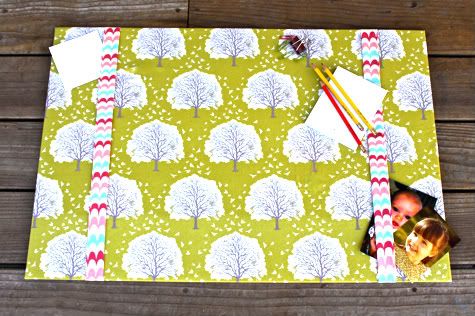

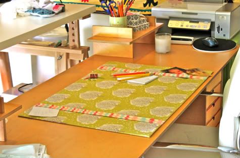
I've been working on sprucing up my hot-mess-converted-garage into a cozy and organized office/sewing room.  I want to add some warm touches that make the desk seem like a peaceful place.  I find this Majestic Oak fabric in Grass by Joel Dewberry is so soothing to look at, that I thought gazing at it peeking out under my laptop would add a little zen to my workday.
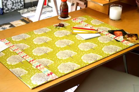
This desk pad is so simple to make, no sewing is required, and you could also do it with a pretty paper.  Get the full Fabric Desk Pad Tutorial (and lots of different customization options) after the jump...

DIY Fabric Desk Blotter

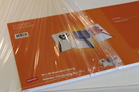
1.  You need a base for your desk blotter.  You could recylce a piece of cardboard as long as it is nice and flat. You could also use posterboard (a little flimsy) or foam core (kinda smushy to write on), but I found that illustration board has the right amount of firmness to give your desk pad heft.  You can buy illustration boards at most office supply stores or art stores, or here on amazon for $3.89.  I used two 20"X30" boards for this project, but you can make it whatever size you prefer.

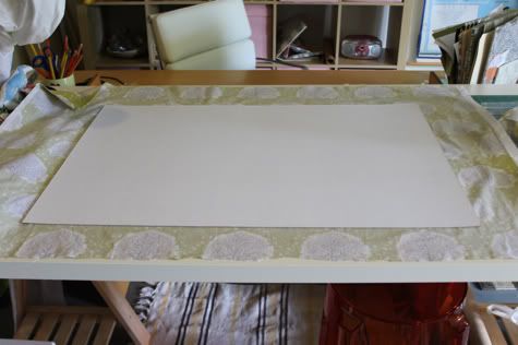
2.  Iron your fabric really well, you don't want any wrinkles or creases.  Lay it right side down on a table and lay your illustration board on top.  It doesn't matter which side, illustration board is the same on both sides.  Center your board and make sure your fabric is straight so it will look all nicely aligned.

3.  Trim all four corners like so:


4. Use a spray adhesive and spray one short side of the board, then fold your fabric over it and stick in place.  You have a few seconds to lift and move if you want.  Firmly press it down and smooth out any bubbles:
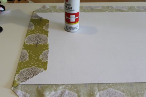
Repeat on the opposite side, pulling your fabric taught but not tight:
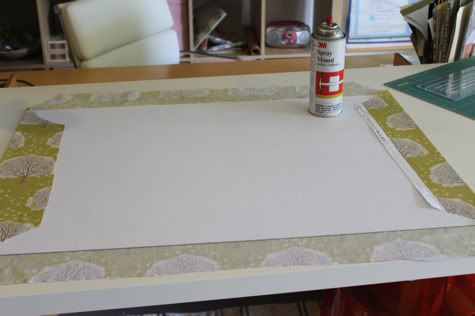
Then spray and attach the top:

And finally, the bottom:
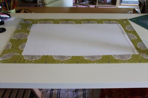

5.  Now you can just call it a day, but it's useful to add some embellishments to allow you to store notes and the like.  Here are some options I played with...
Making bands in matching fabric on either side:

Making a full pocket on either side in matching fabric (with interfacing ironed on to make the pocket firm):
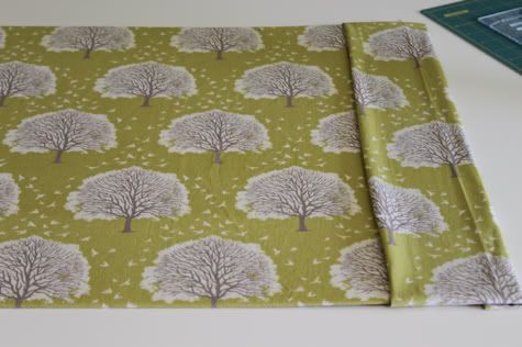
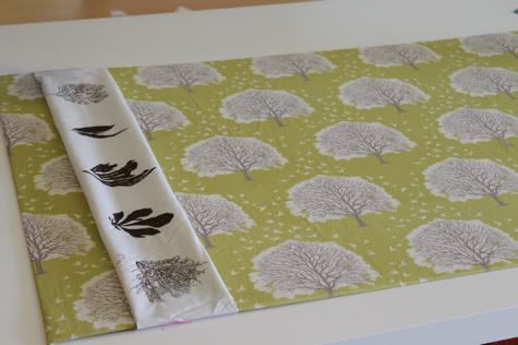
Making a thicker band in a matchy fabric:
Using ribbon along one side and the top:
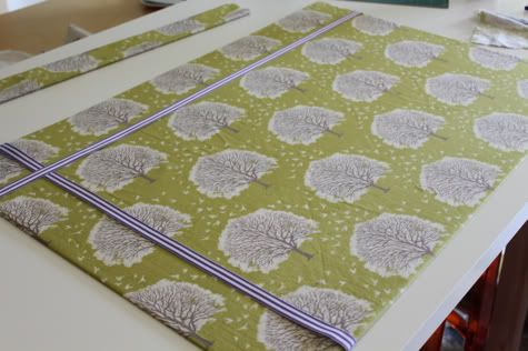
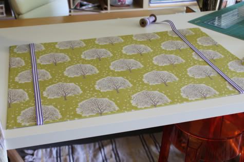
Using ribbon along two sides:
I also really wanted to use two long pieces of elastic sewed into a tube to wrap around, but I only had neon pink and blue, which I wasn't feeling.  I also played with the option of using interfacing to make firm corner pockets, but I realized I don't like corner pockets becuase they don't hold enough.
I ended up deciding to use Alexander Henry Caitlin Stripe in Pink/Aqua to make two bands, because I want symmetry at my desk.  This fabric totally contrasts and seems like a weird choice, but it's another fabric I just love looking at so I went for it.  What do you think?  Did I choose wisely?

6.  So go ahead and cut strips double the final width you want your bands and about five inches longer then the width of your board:
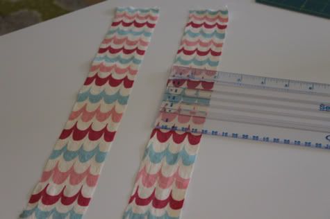

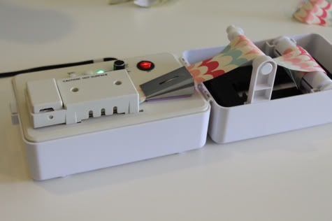
7.  I wanted to make this a no-sew fabric desk pad, but if you wanted to, you could fold your strips so the long edges are right sides then sew up the edge and loop turn them right side out, then iron flat with the seam to the back.  For a no-sew version, iron each edge of the strip into the center.  I used my new best friend, the Bias Tape Maker (see the video of the machine making these strips here) to do that work for me:

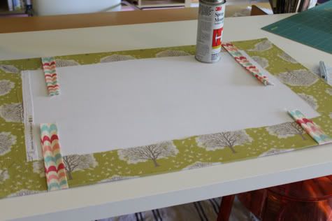
8.  Wrap your strips around your board at even distances.  With the wrong side of the desk pad facing up, spray your adhesive and press the strips in place:

8.  Take your second piece of illustration board and trim a tiny bit, just 1/4" or so, off the top and side:
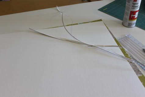
Spray the entire wrong side of your desk pad with adhesive, then center the second board on top and press into place, for a nice finished, non-lumpy bottom:
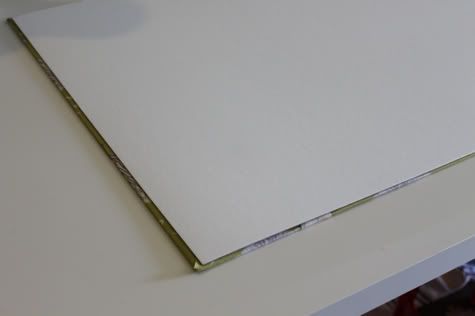

Done!  Place on desk.  Get to work.
Labels: , , , , , , ,

10 Comments:

Blogger D'Anna said...

Really nice! and I love your fabric choices!

June 9, 2010 at 4:55 AM  
Anonymous Anonymous said...

great fabric choice!

June 9, 2010 at 6:07 AM  
Blogger Catherine said...

LOVE this! Thank you for sharing.

June 9, 2010 at 7:17 AM  
Blogger brittany susan said...

love it!!!

June 9, 2010 at 12:08 PM  
Blogger Jacinda said...

My poor desk! I need to make one of these ASAP. It's gorgeous!!

June 9, 2010 at 12:20 PM  
Blogger Joy said...

What a great idea! That's exactly what my desk needs...thanks for the tutorial.

June 9, 2010 at 2:38 PM  
Blogger Stevee said...

Adorable. And look at that cute picture of little Jaime!

June 9, 2010 at 9:07 PM  
Blogger Stephanie B. said...

I just moved into an apartment, and right now I have an ugly calendar on my desk with white walls surrounding everything. This will be a super cute touch up to what seems so boring! I'm excited to start making this and have something exciting to look at!

July 27, 2010 at 7:00 PM  
Blogger Elise McKenna said...

I tried this today (with plenty of time until Christmas in case I screwed it up!). If anyone is thinking about trying this tutorial, it really is as easy as the directions lay it out to be. I used a striped fabric which made it easier for me to line it up properly. Hopefully my boyfriend loves it as much as I do ;)

Thanks for the tutorial!

November 17, 2010 at 1:14 PM  
Blogger Mirawyn said...

Love it! I won't have time for months, but this may be on my summer craft list.

For anyone else considering one, illustration board is also available in black. (One brand is "Super Black.) That would be a great choice with dark fabrics, especially if the fabric is a wee bit thin.

January 24, 2012 at 12:32 PM  

Post a Comment

Subscribe to Post Comments [Atom]

<< Home